Tuesday, March 19, 2013

All White


This all white webpage gives of a sense of cleanliness, professionalism, and simplicity.  Reminding you also of sketch book paper and how that is also a bright white. The image helps tie in the page to being a art portfolio site. With grey and black text the information is easy to read and viewer friendly on their eyes. The site all together is a little simple but for its purpose seems to work just fine. I would add some kind of contact information on the bar at the bottom to give the view some kind of human connection. 

Green in Web


This website uses green in a successful way. When some websites over use green they seem to give off a "nature" based site or a "go green" vibe. This green at the way top doesn't cripple you into thinking this site is all about nature. Having a long box in the center helps break up the page from the header to the body area of information. The image gives off a grungy feel and makes the viewer question what this site is about.

Dark Crimson


This website uses red affectively in its design. The darkness of the red is friendly and inviting to the viewer's eyes. The viewer does not need to strain when viewing this read, unlike the red used in "Target's" website. 

The change between dark and lighter red gives a great contrast to the page and helps separate information and tables boxes in the site. 


Color Scheme Designer


http://colorschemedesigner.com/

Color Scheme Designer is displayed on dark grey background. A good way to display each color to its fullest potential. This site gives you web friendly color choice that can help you create web pages or help you brainstorm color schemes for upcoming works. 

The website is a very user friendly site where the navigation is aligned to the right side of the page after the header and logo. i would make some of the more important options text a little bolder than it currently is to help them stand out on the page.

Surfer

http://www.surfermag.com/

This website uses a large photo as it's backdrop. The image is very nicely used as a background. The darker saturation of the photo helps to not distract the viewer from the important information provided. The important information is display in white boxes with black text. A very easy to read website with brightly colored photos to help liven up the page. The header consists of a moving slideshow of important pages in which you can click on to view. A very clever way to draw in some viewers.

This website displays a good use of simple text and coloring for a website. I would move the scroll area on the right farther down on the page.

Monday, March 18, 2013

The Home Depot

http://www.homedepot.com/?cm_mmc=SEM|THD|G|BT1|HighVolumeExact&skwcid=TC%7c13614%7chomedepot%7c%7cS%7ce%7c21601746204&gclid=CKbBsJrYh7YCFY6e4AodGGoASQ


Home Depot's page is very "guy" friendly. The center information is placed on wooden boards. A nice twist to the genre of what is sold at the store. The top navigation is to the right side with simple pages. All of the merchandise and projects are located on the right side of the page. This set up is easy to use for any age and organized in a logical fashion. I would possibly change the larger white boxes at the bottom of the page. Maybe making them shorter and less detailed would help make them less overbearing.

Walmart

http://www.walmart.com/

After critiquing Target's website I thought I would take a gander at Walmart's page. Walmart coloring is very pleasing to the eye, unlike Target, Walmart uses a calming blue. The logo in the top left is a nice place to see the logo as we read left to right. The footer is very basic and not balanced with the top of the page with its header. The side bar is very white, I think if they used blue throughout the sidebar the text will be easy to read and eye pleasing.

Target

http://www.target.com/

I have always had a negative view on targets website throughout the years. The red they use is an eye sore and all of the different brightly colored text does not help. The bright yellow they have on the red is very hard to read. If they picked a darker red it would look a lot better. Also the set up of the page is a little cluttered and crazy. The footer is a little basic compared to the header, so this site is very top heavy. This site needs more balance throughout.

Forever 21

http://www.forever21.com/Product/Landing.aspx?br=f21&category=apparel

Forever 21 page use a lot of simple black text on a white background. With a simple background the merchandise is easier to view without a backdropping distraction. This page is very photo based, the contents on the page allow you to click on them and go into another page consisting of more items in that section. This a different approach to displaying information and images of merchandise.

The footer consists of social media and small sized font. The header is a centered type of the store name.

Think Geek

http://www.thinkgeek.com/

Think Geek's website uses a black/grey background with blue navigation that stands out. The side bar is a darker grey with white text. Different text contain bolder looks or coloring. The center information on the website rests on a white background with black font which is easier to read and view. The footer on the page is a blue gradient with navigation also inside of it.

I would change the blue gradient in the footer to a solid"darker" blue to be less distracting. The white center box is basic but I don't mind it.,,maybe if the font had a better hierarchy system going on.  

Thursday, March 14, 2013

Baby Shoes


This website for baby shoes uses simple illustrations and pastel coloring relating to "baby" colors.
Using blue and pink with an addition of a blue sky and green grass. The header is very thick, though the footer has it beat. The footer could look better if the image was better illustrated. The hill is also very thick, if the hill decreased in height then the website would look less bottom heavy.
I would focus on the center information and images opposed to focusing all of the attention on the footer after all of the important information. 

Watches


This website for watches is based on a black and dark grey color scheme. The hints of red throughout the site help brighten up the site and set your attention to important information. The images on the site are based on a white background, brings attention to the details in the image. Showing the customer all of the details in the watch. 
The navigation aligned to the left is a different approach to the navigation that usually spans along the entire page. When clicking on the navigation choice the drop down menu turns red with white font. That helps the viewer separate from the rest of the website and its darker scheme   

Wednesday, March 13, 2013

Sephora

http://www.sephora.com/makeup?pageSize=-1

Sephora's makeup website is clean, to the point, and easy to navigate. Having pictures for each item helps the consumer understand and see the item(s) being advertised and sold. With a black and white theme the site seems sophisticated and classy. With hierarchy text showing headlines and section differences. Simple header with a simple following navigation. Using an image with text to create a title after the navigation to let the reader know what page they have clicked on.

Petfinder

http://www.petfinder.com/awo/index.cgi?action=state&state=MD&limit=100

I recently went back to a website I used a year ago to locate a little friend. When searching for a puppy my boyfriend and I came across "Petfinder". A very useful and user friendly website. Although looking back at it now it is very unattractive. Bright purple on pale yellow to start, very eastery looking. The links for each shelter is hyperlinked in bright blue.

I would consider changing the blue hyperlinks to a black or deep purple. The yellow background takes away from the site, perhaps making it white or a darker purple with make it more eye pleasing for the viewer.


Petsmart

In class yesterday we learned about creating and editing tables in Dreamweaver. When looking at websites online I started thinking about how to go about creating tables for each site.


http://www.petsmart.com/?OVMTC=Exact&site=&creative=29999428670&OVKEY=petsmart&url_id=148601532&adpos=1t1&gclid=CO-X0_ny-rUCFYdT4AodYxwAjg

Petsmart's website definitely uses a table/ grid. Having a long single row at the top, separated row with 4 columns in the middle and another row before the footer. This set up helps separate all of the pages petsmart has to offer to its customers.


Relating to how we made tables in class and having to imagine how many rows and columns are needed to display your information properly and affectively.

Tuesday, March 5, 2013

Essie

http://www.essie.com/


-Essie's website uses an all white background, on the left side of the site is the logo. The logo looks to have a embossed feel to it giving it acknowledgement but not an over the top one. The flashing slideshow displays the different type of nail polish the company sells. The footer is centered and clean, the font is small but still legible. The navigation is based off of photos under the header.

Wet 'N' Wild Beauty Site


http://wnwbeauty.com/index.php


-This beauty site for Wet 'N' Wild focuses on the main topics they want you to see, like their new lines of beauty products or sponsors. The background is visible under the box of information, the white box with black typography is easy on the eyes and better to read. The navigation could use a little tweaking,  when you click on a options the menu bar that comes down is very light and jumpy. 

Vintage Page


-A photography website using soft coloring, focusing on one main photo on their home page to not overwhelm their viewers with photos. The color scheme looks to be based on a vintage appeal/ approach. The font used is very girly and elegant, cursive for the navigation and titles on the pages. 


Basic Photography Page


-A basic photography website using a black background and colored photos. The font color used does not stand out well enough on the black. The white works perfectly on the black background. The photo of the camera in the top left is a creative idea, having the photos coming out of the lens. Maybe the photos coming from the lens would look better if the increased in size as the get farther from the camera. 


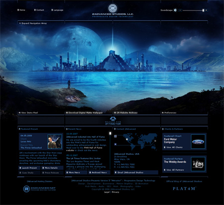
Blue and Black Site


-  The colors used in this website work very well together. The different shades of blue contrast nicely on  the solid black background. The blue text pulls together the website and keeping everything in harmony.

-This website is a great example of how to use colors from the image and use it within the site.